HAYLEY HATFIELD
Wednesday, 8 May 2013
Tuesday, 7 May 2013
TA DAR!
It is shorter than 30 seconds because i realised i needed less frames e.g. turning the page. However i think the music fits with the animation. I wasn't going to have music at the beginning however, after playing around with the music i realised that it needs to fade in at the beginning and fade at the end to tie it up.
I wanted it to be a playful animation with colours, camera angels, randomness and nothing too literal and i think i have achieved this. I think after watching the inspirational videos i wanted to change my mind on whats exactly going to happen between each scene.
Iv used my examples to practice on and used my old storyboard for referencing. My storyboard told me which part should be were and when to change the scene. I didn't want to do something different or it wouldn't relate to all the time and effort of playing with playdoh.
Iv really enjoyed this project, its my favourite one so far. Playing with playdoh can be too fun sometimes. Im happy its done and is wanting to do more in the summer :)
Here is my video showing you my thoughts on animation. Fun and colourful.
Change of plan, I know it pushing it but its for the best.
After doing half of my final i wanted to see how it would look before carrying on and i found that i didnt enjoy it and it was abit all over the place, thats why i have thought up of a new story board. Keeping the 1,2,3,1,2,3,1,2,3,1,2 movement. I think this is more playful and enjoyable. I have done two different finals but i am only going to pick one for my hand in animation.
The general idea behind this story board it that my thoughts change all the time so every time you change the page so does my thoughts. I wanted to to base two on shapes and the other two on charters e.g. fish/worm. Then the other is shapes circle/squares, simple but effective. I hope you like it.
Im glad i pick to do stop motion animation with playdoh, it didnt make it into a chore. I had fun at the same time of making the videos.
I like the inside one more, its more controlled and flows alot better. This is 24fps so there was more images to take but it was worth it for this end result. I wish i would had put more frames in for the fish coming in and out of the page because thats my fav scene. I think i will use this one for my final animation, its longer and fits with the music more. Both videos i had fun with and hopefully i shall get better.
And playdoh gets dry in the sun. No good.
FISH SCENE: Playdoh cracked because its too dry
Good old playdoh!
ice cube moulder but ice that looks like fish. I took this and used it for playdoh mould having the same size for each fish.
Doing the fish scene
Doing the circle scene
Doing the worm scene
_______________________________________________________
New story board, sorry about the photo quality.
Start:
-zooming out of book
-opening book
-shapes move up and down (squash) 3 times to beat 1,2,3
-turn page
-fish jumps into book with his friends
-wiggles his tale
-turn page
-different colour squares form a circle
-move in and out
-close book
-BOOKWORM crawls onto book
-worm disappears
-ends with a splat
-FIN
_______________________________________
book scene = 72 frames for 3 seconds
_______________________________________
book scene = 72 frames for 3 seconds
1,2,3 = 48 frames for 2 seconds
1,2 = 24 frames for 1 second
splat = 48 frames for 2 seconds
Tuesday, 30 April 2013
NEED TO KEEP PLAYFUL!
Iv just found this video and i think its relevant to add it to my blog. Its playful, colourful and is abstract. Everything flows really well, the movements of the fish and other creators are really focused on, without that it wouldnt work. Really love this video and im abit jealous.
Monday, 22 April 2013
Workshop experiments.
I can animate: Lego stop motion:
I love lego so this was by far the best workshop this year. This was another reason why i wanted to create stop motion in a playful way. Here is a website that shows you 6 sec animations.
http://legovines.tumblr.com/
Here you'll be able to see amazing stop motion designs. I wish i could change mine to lego, however its too late now, iv bought they playdoh.
Me and Andrew robinson having fun with lego. Loving life.
other workshops have not been saved
other workshops have not been saved
Wednesday, 17 April 2013
Tuesday, 9 April 2013
Story boarding Idea 1.
These are thumbnails for my final video. I want to make sure its perfect before starting the process.
Here is a blank canvas, playdoh as the paint and using objects as your paint brush OR spaltting the object onto the canvas, only good things will come out of this. After putting the object onto the canvas it comes to life, pulsing/moving/fluttering to the beat of the music then for the ending the painter trys to gets the objects out to their original form but they dont want to leave all the fun.
IDEAS:
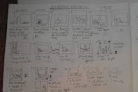
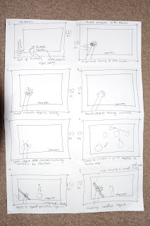

This is a crappy photo and i need a new camera.
Here is the general idea with the key frames. Iv tried to keep it simple and not over complicate the process. As you can see iv repeated some scenes but the main theme to this song is repeat so i thought it went quite well.
This is my final story board.
yes they may look like scribbles but to me scribbles make more sense.
CLAY TIME! Practice time
Here are a few examples of me playing with clay. These are only experiments, not part of my final video.
Play doh instead of clay.
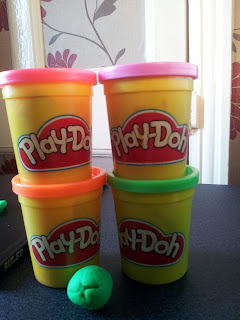
I bought a four pack play doh set for the clay. I wanted different colours to represent different images throughout the painting scenes in the animation. I think this is important so the views can see the difference.
hand pressing down. Simple but effective this movement.
I like how the worm wiggles its way into the apple. Fun design.
This is the best tester iv done so far. I like how my hand moves with the objects in hand.
Crap. Not enough frames.
bored.com
my camera keeps going blurry when i take photos, getting annoying.
getting there but not right. 48 frames for hand moment needs reducing
prating
2 sec winning
You may be asking yourself why so many videos? The reason why iv done so many is because once i re created a sample of my story board i didnt like the in between movement of the shapes. So i wanted to think of something else. I aimed towards making it related to the theme such as brushes and including my hand. In the end iv got a better idea and will make a new story board to show where i have made the changes.
You must also be wondering why is there only one camera angle? simple because i am trying to represent paint that comes to life then can morf into anything e.g. a 3D circle. If i make it very obvious that it has turned 3D then it will work with my idea.
You also must be wondering why i have decided to stick with using the brown floor instead of a nice white sheet. Simply because its based around me getting my paper and equipment getting ready to paint in my room. This makes it more personal, instead of white background, white paper... it will not give the right impression to my idea.
I have timed my animation to the last frame and second so hopefully it will fit like a glove.
Camera angles: I will try other angles to see how it would look however, i think its time i start on my final outcome.
Type of animation im doing: Stop motion vs clay. Let the battle begin!
Example of clay and human interaction. Simply amazing. Its only 30 seconds like my animation is going to be, however hes got so much into the video, different charters, movement. It doesn't tell a story but showing familiar designs e.g. spider on the spider web which is spiderman. We think of this automatically. Maybe i should you key things to make sure my audience knows whats, what.
The reason why im doing stop motion animation rather than the rest os because it looks the most interesting and who doesn't like taking 100s of photos. I do think its very challenging to interduce clay and stop motion together when iv not done stop motion before but thats all going to change. Im really excited to get started.
Iv decided to go with idea 1. I think its the most creative one out of the bunch and hopefully no one else will be doing it. Its thought by me, clayed by me, filmed by me, story board from me and filmed with me in it. I have a lot of roles to fill and it will be hard, time consuming and key to get it right or it simply will not work. Now iv picked idea one i shall be developing with clay to practice with then show my progress for the final video!
I think that clay will be very fiddly and i might get stressed with it, although i think my stop motion video is going to be playful! I want to practice doing suttel movements to make my 'paint' (play doh) effective.
I think that clay will be very fiddly and i might get stressed with it, although i think my stop motion video is going to be playful! I want to practice doing suttel movements to make my 'paint' (play doh) effective.
WISH ME LUCK! Me and clay are going to be peas in a pod... in the end
Even with these two videos you can see how effective clay can be, very suttel movements make all the difference I LOVE the xbox video, however the skills to make it as detailed as that will be very difficult. I want to aimed towards turning realistic objects and turn them abstract.
Its all part of the fun.
IDEA TIME! think hayley, think!
RIGHT! lets get some ideas down on paper... were do i start?
CHOSEN Idea 1: painting with clay on a blank canvas and make it alive.
Type: stop motion
Word: entranced
Basic steps: using clay/play-do on a blank white canvas
use objects as a paint brush/object is transfered onto canvas
splattered paint (clay) forms into an image and moves to music e.g. pulse
stand up tilt one way than the other, clay moves like water to a corner
paint falls off and bounces then object reappears or shake at end and objects come off at same time
end.
Idea 2: downloaded into computer and try and find your way out.
word: journey
type:mixed media
Idea 3: object/man in Elevator when it opens and closes a different scene happens e.g. octopus attacking. Goes to the beat.
word: Curious
type: drawn
Idea 4: abstract game using a ball. Can go through different levels/elements to get to the end.
type: drawn OR digital
word: journey
Idea 5: two men/objects dinging on a bell to the beat of the music and as it goes along other objects interact to play other parts of the music.
type: drawn
word: entranced
____________________________________________________________
The reason why iv decided to go towards stop motion is through my research, iv looked at every possible animation and this appeals to me the most. With my idea clay, stop motion i think it will be pretty amazing. I want it to be as playful as this video.
CHOSEN Idea 1: painting with clay on a blank canvas and make it alive.
Type: stop motion
Word: entranced
Basic steps: using clay/play-do on a blank white canvas
use objects as a paint brush/object is transfered onto canvas
splattered paint (clay) forms into an image and moves to music e.g. pulse
stand up tilt one way than the other, clay moves like water to a corner
paint falls off and bounces then object reappears or shake at end and objects come off at same time
end.
(This is just an example of a stop motion animation home based studio.)
This is what i will need to do to achieve my idea. I was thinking about doing my stop motion animation in the studios in sheffield hallam, however i think for the amount of time i will be spending on it i think it will be better if i do it at home. I will borrow a camera, tripod and try and find the correct lighting e.g. lamp but not natural light because i need the constant images (no shadows). I will be wanting to create my own studio in my room, however my camera view is only birds eye view so i will not need a white background like this. I think this will be easier overall and cant wait to get started.
____________________________________________________________
word: journey
type:mixed media
Idea 3: object/man in Elevator when it opens and closes a different scene happens e.g. octopus attacking. Goes to the beat.
word: Curious
type: drawn
Idea 4: abstract game using a ball. Can go through different levels/elements to get to the end.
type: drawn OR digital
word: journey
Idea 5: two men/objects dinging on a bell to the beat of the music and as it goes along other objects interact to play other parts of the music.
type: drawn
word: entranced
____________________________________________________________
The reason why iv decided to go towards stop motion is through my research, iv looked at every possible animation and this appeals to me the most. With my idea clay, stop motion i think it will be pretty amazing. I want it to be as playful as this video.
FUN FUN FUN
My song: Exchange
This is the song that iv been given. Its has a repetitive beat and it is slow compared to the other songs iv herd.
After listening to my song over 50 times iv came to a conclusion how i feel about my song, not very good. However, iv chosen three words that describes the song that i can incorporate into my animation. I think its very important to find out the definition of the forwards before moving forward. I also think its important to look at some images to show how they interpret the meanings.
Entranced=
Definition:
|
captivate, hypnotise
|
Synonyms:
|
anesthetize, attract, bewitch, charm, delight, enchant,
enrapture, enthrall, fascinate,gladden, mesmerise, please, put in a trance,
ravish, rejoice, spellbind, transport
|
Antonyms:
|
disgust, repel, repulse, turn off
|
Curious=
| Definition: | desiring knowledge, understanding |
| Synonyms: | analytical, disquisitive, examining, impertinent, inquiring, inquisitive, inspecting,interested, interfering, intrusive, investigative, meddlesome, meddling, nosy, peeping,peering, prurient, prying, puzzled, questioning, scrutinizing, searching, snoopy,tampering |
| Antonyms: | disinterested, incurious, indifferent, uninterested |
Journey=
| Definition: | excursion |
| Synonyms: | adventure, airing, beat, campaign, caravan, circuit, constitutional, course, crossing,drive, expedition, exploration, hike, itinerary, jaunt, junket, march, migration, odyssey,outing, passage, patrol, peregrination, pilgrimage, progress, promenade, quest, ramble,range, roaming, round, route, run, safari, sally, saunter, sojourn, stroll, survey, tour,tramp, time, transit, transmigration, travel, traveling, traverse, trek, trip, vagabondage,vagrancy, venture, visit, voyage, wandering, wayfaring |
I have so many choices to pick from the meanings of my chosen words. I could pick one or all three to interact with each other in my idea OR i could chose the meanings within the word.
Group animation.
Before the holidays we were told to do a group drawn animation, however i think our idea was more complicated than it should have been. Been simple can be more effective.
This just proves it. We decided to choose something hard to do. As you can see people are scattered around doing 1 key frame or more. I wished we would have done the chicken just jumping up and down, however here is the process we had to do to get the final video.
This just proves it. We decided to choose something hard to do. As you can see people are scattered around doing 1 key frame or more. I wished we would have done the chicken just jumping up and down, however here is the process we had to do to get the final video.
Here you can see the final video, it all came together in the end. This had made me not want to draw animation. I like the idea of digital or stop motion but this is very fussy for me and expensive in rubbers.
This is the first time any of our group has done animation and by us all doing it at home there is a different style with each person (colour, thick/thin lines) I really love our male chicken laying an egg and thinking what the hell. Good team work guys.
Tuesday, 2 April 2013
Playing with animation.
Iv decided since iv never done animation and have no clue how to do anything! i shall watch youtube videos and make my own silly animations, nothing relating to the final just a bit of fun to understand how and what to do. I will use my phone as the camera to shoot everyday life into animation. I think this sounds fun, fun, fun!
Im wanting to create stop motion for my final so i think its important to practice. I dont know what my song idea will be but i personally find stop motion more appealing as a beginner.
This is another video of my car moving. I do need more frames per second to make it flow better. I want to try alot of frame 25 per second then 12 per second to see the difference and which one will look better for my video.
This video just shows that im not a paient person when it comes to taking videos, however my hand was hurting holding the camera up at the same angle. I will find it easier to control rushing my hand for the next frame.
Monday, 1 April 2013
Think its about time to stop looking on the web at animations!
Promise i shall stop looking at other people videos and start creating my own!
I will start by writing down my music. This will show the beats, timing and how i interoperate the song. Also it can influence any ideas, make the timing better for my final and to fully understand how music and animation goes together.
Video of my music:
I think its important to look at music in detail. Here you can see my interpretation and what the software interoperates it. As you zoom in you can see the sound waves flow. I thought the movement in certain areas was really lovely and could use it in my animation? However, i think its important to keep it to how the song makes me feel rather than what other people/software sees it as.
Thursday, 28 March 2013
Favourite animation!
This is abstract, creative, receptive, moves to the music and a story.
Its a music video that has really inspired me! It uses the music as well as story telling to take you on a journey. This journey is about the moon, planets and the women who worship them. I like it so much because from beginning it had my attention. If i had the skills, time and creativeness i would love to do something like this, however never doing anything like this i dont know how to.
I found this video on The creatives project
http://www.thecreatorsproject.com
This is also another amazing video from that website that you would really like, using sculptures and light to give an illusion.
I found this video on The creatives project
http://www.thecreatorsproject.com
This is also another amazing video from that website that you would really like, using sculptures and light to give an illusion.
ALL THE VIDEOS THAT HAVE BEEN ADDED ONTO THIS BLOG IS BECAUSE I THINK THEY ARE CREATIVE, GOOD AND APPEALING. SO THEY ARE NOT ON TO FILL SPACE.
Iv watched more than you can imagine and only put the best onto my blog.
First short animation i saw.
I saw this a few years ago and i thought it was amazing and sad at the same time. The graphics wasn't amazing but that didn't put it down for me. The story really brought it to life so i think its important that i have a story to my music or follow my music with the rhythm, if not my animation will be unsuccessful.
Thursday, 21 March 2013
Opening Animation to Movies. (RESEARCH)
The OZ! the great and powerful.
Here is an opening title scene. The animation is really amazing! so many layers and movement to make it realistic. They have gone for a paper, texture style i can say this because of the sticks with an image on it. The text is the main focus point for me its in different places and fits in the right places on the screen. Everything has a reason and purpose which is shown in a story like way to get the views have a feel on how the movie is going to be (building them up) for the film. Overall, i think this opening scene was better than the film, it told a story better as well as having in chanting music pulling you into the screen.
Making Music (RESEARCH)
I cant read or write music, iv always thought of it to be boring but this video showed me wrong. If your wanting music to be the theme/style of your animation this is as good as its going to get. The twist of writing and speeding it up/down to match the music is the story telling. She has done her hand drawn designs with the music to make it one. You can see this when she drew the cars and used the musical notes as the wheels. She is completely aware of of the notes. If i was going to use this type of animation i would need to get a music software to break it down for me and show me the notes because i havent got time to learn how to read/write music so i will not be using this method but i think its beautiful and orignal.
Sunday, 17 March 2013
Text Animation (RESEARCH)
I think text would be the easiest style for animation, the text is already on the computer, you just need to manipulate it (movements, size, layout). In some of these videos you can see that they have added images/icons too, which improves it by far for me because it looks appealing and harmonises with the text.
This video is too obvious. The text does what the word means (kentic animation). Its interesting to see how people interpirate the meaning to words and people can learn better this way because you have sound (auditory) word (visual) movement of text (kinaesthetic) so no matter how you learn as a person this video can teach you.
Very simple movements of each letter, i put this on my blog to show it doesn't need to be complicated to be creative. I think the thing that i liked the most about this video is that each letter was originally a sheet of paper folded into a letter. It could be improved by making it go with the music to put it all together.
This is a quote transformed into a short animation. So simple and effective! I would be happy to have something like this as a final animation, however its a kentic animation and uses spoken words instead of music to represent.
I really enjoyed this video for the movement and camera shots. I dont think that the music and the actions of the animation matches but its a narrative about the red wine. I think they did a very good job with the movement of the text e.g. the text is red wine been filled to the word ted.
Ads Animation (RESEARCH)
These are more abstract ads but i thought to include them because i think they are great examples that have been professionally produced and shown to the public. Does it work? Could i do something like this?
This is my favrioute ad animation out of the lost because the digital and drawn are beautifully put together. The drawn side of it literally comes off the page! A lot of skill and time has gone into this video and you can tell, hopefully you'll be able to get that feeling with my final.
Google chromes logo is already abstract so why not this ad? I really enjoyed watching this clip. I dont know if its my style but it was well put together, everything flowed! I also loved the animation side with the shapes moving, harmonising the shapes together, well done google chrome.
How cute and amazing is this Mc Donald's nugget? I would love to experiment with something like this. Drawn object meets real object. The concept is simple, however moving the drawn images whirl having the real object onto may turn out difficult.
Subscribe to:
Comments (Atom)

